 By Beth Kelsey, EdD, APRN, WHNP-BC, FAANP
Have you recently completed your research study or quality improvement (QI) project, submitted an abstract for conference presentation consideration, and been accepted for a poster presentation? If so, congratulations! Presenting a poster is an excellent venue for disseminating your research and project outcomes to colleagues. Poster presentations, more so than podium presentations, provide an opportunity to interact with individual viewers and with small groups of conference participants. If you are new to presenting, poster format can be less intimidating than standing in front of a large audience. In addition, the one-on-one contacts you can make with a poster presentation are a great way to network with others interested in your topic and to explore possible next steps in your scholarly and professional endeavors.
First, read the poster guidelines provided by the conference organizers. Find out the size requirements, as well as whether to use a landscape or portrait layout. Landscape layout, in which the width of the poster is greater than the height, is more commonly used than portrait layout. Determine how the poster will be displayed (e.g., on an easel, attached to corkboard, free-standing) and any set-up dates and times. If the conference organizers have archived posters from the previous year, you may want to look at them for the formats used.
Next, check with your sponsoring institution to ascertain whether it has any specific requirements concerning poster format and institution recognition. If you use your institution’s logo on the poster, make sure that it is an approved version.
Start work on your poster early, which will give you time to experiment with layout and get graphics prepared. Starting early also provides time for review of your poster layout and content by colleagues with poster presentation experience. Avoiding last-minute preparation of your poster allows time for any printing or shipping delays that may occur.
Poster components
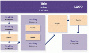
All posters need a banner at the top. The banner must include the poster title, names and credentials of the authors, and the name of the sponsoring institution (e.g., school, hospital, other agency). An approved institution logo can provide an eye-catching graphic on the banner.
Your poster title should be relatively short—no more than 10-12 words—and should attract the attention of conference participants who may be interested in your topic.1-2 For most conferences, the expectation is that the title on your poster will be the same as that used on the abstract you submitted. This expectation does limit your creativity if you have not planned ahead.
Whether your poster presents a research study or a QI project will influence the other components, although there are many similarities between the two. You can use the abstract you submitted as a guide. Your institution may have a specific template that they will want you to use.
Sections for QI projects may include variations of (1) background knowledge; (2) purpose/goal; (3) intended improvement/outcome objectives; (4) conceptual framework; (5) methods, including subsections for setting/population, intervention, and methods of outcome evaluation; (6) results/outcomes; (7) limitations; (8) conclusions; and (9) implications for nursing practice. Posters on original research generally include sections for (1) background knowledge; (2) purpose/significance; (3) research objectives/questions/hypotheses; (4) methods, including subsections for design, sample, instruments, and data collection procedures; (5) results; (6) limitations; (7) conclusions; (8) implications for nursing; and (9) recommendations for future research.
Both types of posters may include pertinent references. As an alternative, particularly if you want to save space, you can provide the references as a separate handout or provide contact information to follow up.
Poster design
Embrace brevity
If you are basing your poster on a scholarly paper, you may have difficulty sacrificing many of the words you have painstakingly written. However, keep in mind that a poster is not intended to be a narrative but, rather, a visual display. Think in terms of key points that can be presented in bulleted phrases instead of sentences. Keep wording simple and avoid redundancies. Viewers appreciate simplicity and clarity. They will typically spend only 1 or 2 minutes reading text on the poster. Use graphics to illustrate your work. First and foremost, you want your poster to be professional, contain accurate information, and be visually appealing.
Concentrate on layout
Attention to the layout of your poster will make it easy for viewers to follow the intended flow of information. Your section headings should help viewers find your main points and key information. The sections should flow from top to bottom and left to right. Arrows can be used to direct viewers from one component to the next (Figure), or or you can place consecutive numbering next to each heading.
I advise brevity with regard to the text not only because viewers won’t spend much time reading what you wrote but also because the essence of a poster is that it is a visual medium. The recommendation that “the majority of the poster should not be text” is an understatement. I have seen suggestions that 20% of the poster should be text, 40% should be white space, and 40% should be graphics. At the very least, plan for your poster to have more graphics and white space than text.1-4
White space, the blank background of your poster, is visually important. You do not want your poster to appear too busy—that is, too crowded with text and images. Viewers will have difficulty following your intended flow and may miss your main messages. Using sufficient white space to separate the poster sections and graphics, will, if anything, amplify and clarify your main messages.
For the text that you do use, attention to lettering is important. Although experts on poster creation differ in terms of their advice concerning letter size and font type for both the title and text of the poster, the main takeaways are that you want viewers to be able to read the title of your poster from up to 10 feet away and the text of your poster from a distance of 3-5 feet.2-5
With these goals in mind, I suggest that the letters for the title be 2-3 inches in height, which, in point-font size, is 144-216.1-2 For names of authors and major headings, consider using letters that are half the size of those in the title, or 1-1½ inches in height (point-font size, 72-108). For the text under each heading, use a point-font size of 24-48. Of course, the letter size you should use depends on the overall size of the poster.1-4
I advise using simple, not ornate, font types for easy readability. Sans-serif fonts, which lack curves or extensions on letters, are more readable from a distance than are serif fonts. Examples of sans-serif fonts are Arial, Helvetica, Verdana, Calibri, and any font with “sans” (the French word for “without”) at the end of its name. Do not use more than two different font styles on a poster; use of more than two fonts can be distracting.
Graphics for your poster may include tables, graphs, charts, diagrams, photographs, and other illustrations. Use graphics to attract viewers’ interest and enhance your message. Balance the placement of text and graphics to create visual appeal. Provide titles or labels that clearly depict the purpose of tables and graphs. Pie charts and bar or line graphs are more appealing to the eye than tables. If you do use tables, keep them simple and keep fonts large enough for easy reading.
When using pictures or other images acquired on the Internet, pay attention to resolution. Use images that are ≥300 dots per inch.2 Once you place the picture on your poster template (e.g., PowerPoint research poster template), keep it the same size to maintain the resolution of the image; if you try to enlarge the image, its quality will diminish. Obtain permission to use any copyrighted images, and provide a credit line under the image. In addition, if you are using photographs in which individuals could be identified, you must obtain these individuals’ written permission to use them.
Choose colors carefully
Color choices can make all the difference in either enhancing the attractiveness of your poster and highlighting its key points or overloading and distracting viewers from your message. Use a white or pastel background and black or other dark-color lettering for contrast. Stick with two or three colors and use them in a pattern. For example, you could use one color for all headings, another color for all subheadings, and then black letters for the text under the headings. You can make graphics stand out by creating a border around them with one of the chosen colors.
Avoid overly bright colors, dark backgrounds, and light letters; these colors can be tiring to the eyes. When choosing colors, especially when designing graphics, consider individuals who have problems differentiating colors (e.g., an inability to distinguish green and red).3
Some Internet printing services have tutorials and general tips on layout, use of graphics, use of poster creation templates, examples of complimentary colors, and other design considerations. Two examples are Makesigns.com and Posterpresentations.com.
Printing your poster
Before sending your poster template to the printing service, take care to proofread it and then proofread it again. Ask individuals who are not familiar with your work to look at the poster to give you feedback on readability, clarity, and visual appeal.
Your institution may have its own poster printing capability that may be less expensive than using other local printing services. Several printing services available on the Internet provide tutorials and templates and have quick turnaround times. Be sure to read the instructions provided for preparing and submitting files needed to produce your poster.
Presenting your poster
Prepare a 2- to 3-minute oral presentation about your project. Practice giving your presentation out loud—to yourself and to your colleagues. Use your poster as you practice. Consider making handouts to supplement your poster presentation. Participants who are particularly interested in your topic will appreciate copies of your abstract, references, and contact information.
Know when you are expected to be at your poster, and be there. Engage with participants who approach your poster. Make eye contact and use a conversational tone. Use your poster as a visual aid but don’t read it to viewers. Poster presenters win awards not only for the poster but also for being able to present information on their projects in a knowledgeable and enthusiastic manner.
You may want to have a notebook available to obtain viewers’ names and contact information if they request additional information. Be sure to follow up with them within 1-2 weeks after the conference. You can also use the notebook to jot down ideas you get from participants.
Remember, you are the expert on your particular research or project. If you have taken the time to create a visually appealing poster and have practiced performing your presentation, you will be able to enjoy the experience and gather ideas for your next scholarly endeavor.
Beth Kelsey is Assistant Professor at the School of Nursing, Ball State University, in Muncie, Indiana; editor-in-chief of Women’s Healthcare: A Clinical Journal for NPs; and NPWH Director of Publications, Washington, DC.
References
- Berg JA. Creating a professional poster presentation: focus on nurse practitioners. J Am Acad Nurse Pract. 2005;17(7):245-248.
- Christenbery TL, Latham TG. Creating effective scholarly posters: a guide for DNP students. J Am Assoc Nurse Pract. 2013;25(1):16-23.
- Hess G, Tosney K, Liegel L. Creating Effective Poster Presentations. 2013.
- Wood GJ, Morrison RS. Writing abstracts and developing posters for national meetings. J Palliat Med. 2011;14(3):353-359.
- Gray J, Grove S, Sutherland S. The Practice of Nursing Research: Appraisal, Synthesis, and Generation of Evidence. 8th ed. St. Louis, MO: Elsevier; 2017.